How to Optimize Process with Data Visualization?
Optimize Processes with Data Visualization

- Global Data 365
Every aspect of a company relies on making prompt, well-informed decisions. Data is at the center of the financial services sector. Traditional business intelligence (BI) methods aren’t up to the task with so much data to rummage through. These techniques were designed for tabular reporting and can only handle small volumes of homogeneous data; they also require advanced technical expertise. Today’s software can process and interpret massive amounts of data in real-time, with a level of elegance previously unseen. By leveraging modern tools to optimize processes with data visualization, companies can transform complex datasets into actionable insights, enhancing decision-making efficiency across all departments. According to a report conducted by Gartner on the top priorities of CFOs, here’s what they looked at:
– Enhancing Financial Analytics:
Even after a 50% rise in financial analytics expenditure in the last three years, only a few businesses have advanced analytics capabilities. As analytics becomes a central responsibility of the finance department, this must change.
– Reorganizing Finance Teams:
Traditional approaches for coordinating and using finance teams are becoming less effective as the popularity of finance teams grows. To stay relevant, the department needs a shakeup from the top down.
– Finance Technology Optimization:
Finance teams must maximize the value of their ERP systems while also adopting newer innovations and planning to become more tech-savvy. If this isn’t done, the finance department will become less intelligent and agile.
Any of those projects could keep a CFO busy for a year without yielding much progress. However, if such executives consider these problems analytically, realizing how the challenges and goals intersect, a surprising approach emerges, data visualization.
Data Visualizations
There has almost certainly been some kind of data visualization for as long as there has been data. Charts and graphs have recently become commonplace in business due to Excel spreadsheets. Users soon realized that visual interfaces help them understand complex information. Instead of manually examining a spreadsheet, they could quickly recognize the key takeaways by looking at a pie chart. Digital visualizations provided the finance team with a unique outlook on data and a game-changing method for decision-making, compared to what was previously available.
Today, visualizations have taken yet another step forward, possibly the most important yet. Advanced visualization features are included in today’s top financial reporting tools, which run on top of ERP and beyond the constraints of Excel. Such visualization tools do more than improve on what has come before; they turn the relationship between the finance team and the data on which it relies more highly than it has ever been.
Advances in Data Visualizations
So, what’s the difference? To begin with, visualizations have progressed well beyond basic graphs and maps. They can now visualize data in new systems that provide more context and information. Users can view the optimal visualization to encompass the data rather than trying to settle for a sufficient option with this enlarged toolkit at their disposal.
After you have made that decision, creating the visualization is nearly seamless. It only takes some clicks to move data from one area to another in several cases, rather than a lengthy manual process. This not only saves time and eliminates mistakes, but it also helps everyone inside or outside the finance department to create their own visualization without any need for advanced training.
Lastly, and perhaps most critically, visualizations have moved to the foreground of decision-making. The finance members can quickly integrate them into financial reports and structure them to optimize the insights they contain as well as the ease with which they can be extracted. The design features within such reports are also not static. They update themselves as new information becomes available, making them more like interactive indicators that monitor key metrics in real-time than visualizations.
In addition to finance, operational and supply chain management teams benefit from these dynamic features. Inventory dashboards, for example, provide real-time insights into stock levels, supplier performance, and demand forecasting. This allows organizations to streamline their operations, reduce costs, and make informed decisions across departments. Integrating financial reports with operational data ensures a comprehensive view of business health, enhancing decision-making at both the strategic and operational levels..
Everything in today’s visualizations is vastly superior to previous versions. Despite this, it’s always easy to underestimate their effect on the economy. The CFO, the finance team, and the company are all involved.
Using Data Visualizations to Optimize Processes
Data visualizations not only help people view data in new ways, but they also help them see it more clearly, presenting insights, opportunities, and challenges that would otherwise go unnoticed.
One form of data visualization does this is by compressing large volumes of data into a readily available layout. Financial reports influence decision-making, but in the past, they were either too simple to show anything of value or too difficult to stir up an action. Today’s visualizations bridge the gap, allowing reports to include what decision-makers need to know while still revealing those insights in real-time.
Advanced data visualizations also allow F&a to investigate financial data on their own terms. Decision-makers know what knowledge they want better than everyone else, and once it’s simple to find it and visualize it as needed, understanding differences disappear. To look at it another way, visualizations open a vast array of nuanced financial data to the point that it can be explored. Anyone interested in delving deeper into the data now has a great starting point.
Visualizations help practitioners outside finance grasp a topic that can be perplexing to the general reader, in addition to CFOs. Executives and heads of departments need to consider how their decisions impact the company’s finances on a micro and macro level, but many lack the knowledge to do so from a dense spreadsheet presenting a financial report. However, when presented with visualizations, the material emerges in a manner that everyone can comprehend. As a result, financial knowledge grows across the board, helping companies optimize processes with data visualization for better decision-making.
Data Visualizations: a Modern Solution
Finance teams will use innovative data visualizations to make significant progress on every one of 2021’s top priorities. Once implemented, analytics improve dramatically, accountants spend less time manually processing data, and the ERP ceases to be a barrier to understanding.
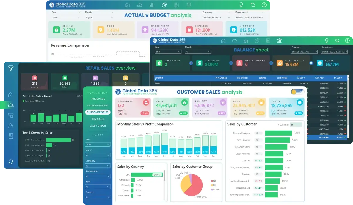
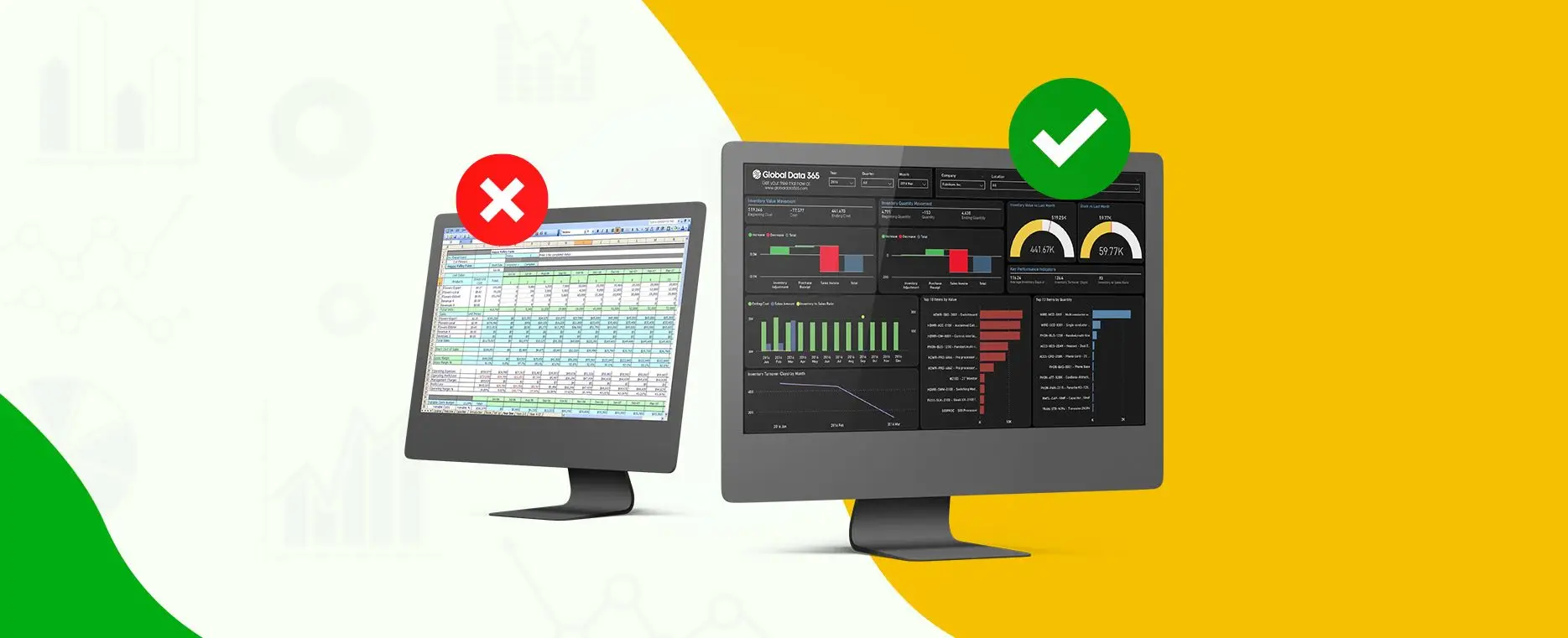
Global Data 365 offers visualization tools to optimize finance processes. In terms of usability, precision, and variety, these resources far exceed what you’ve come to expect from Excel. Even better, they’re just one of many features available in purpose-built financial reporting tools that are designed to work with today’s most common ERPs.
If you’re searching for a new perspective on data, we offer a comprehensive upgrade. To see how this all operates, request a free demo today.
Talk to Our BI Experts!
Search Blog
Related Resources

Overcome Your Fear of Advanced Analytics

Why Power BI is a Better Choice than Excel for Analytics
Unlock Power of Data Visualization with Power BI
Get started with a free consultation today!
Subscribe to Our Newsletter
Optimize Processes with Data Visualization Read More »


