power bi

Power BI Writeback

Power BI Writeback: What is it and Why it matters?

Power BI Writeback: What It Is, Why It Matters and How It Works

power bi for industry

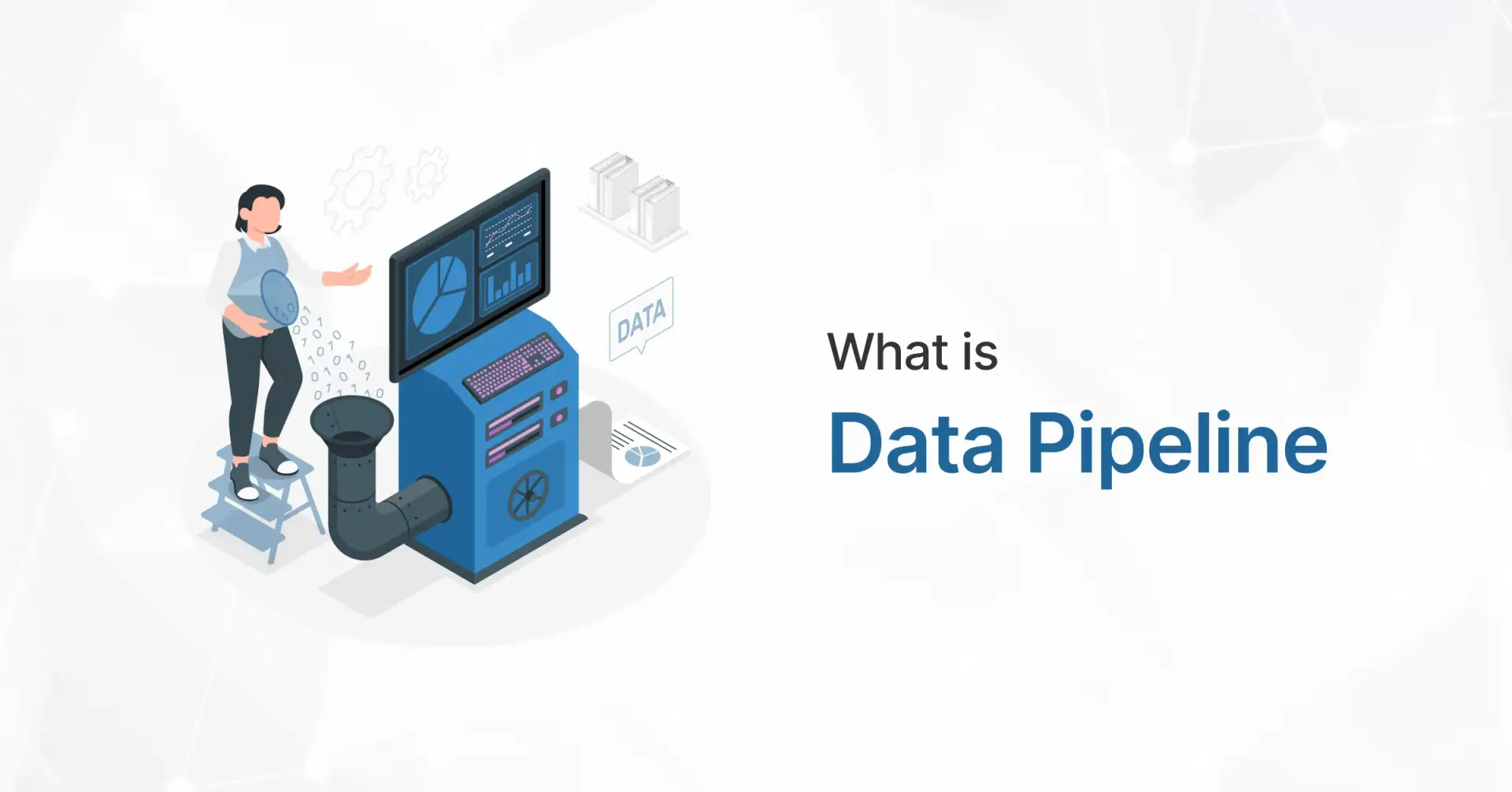
Power BI has always been great for analysis, but traditional dashboards hit a wall when users need to act on insights. That’s where writeback comes in. It turns Power BI from a passive reporting tool into an interactive decision-making platform. Below is a simple breakdown of what writeback does, when to use it, how you can setup writeback in power bi and how it works in real-world scenarios.

What Is Power BI Writeback?

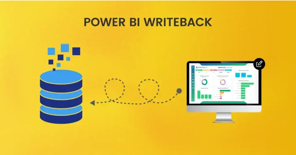
Power BI Writeback lets users send data from Power BI back to a database or application. Instead of only reading data, it lets you update, insert or modify records directly from a report.


In short:
See the data → Edit it → Save it back to the source
All inside Power BI.

Why Power BI Writeback Matters?

Here are some of the key reasons writeback capability is valuable for organizations:

  1. Improved Data Accuracy
    Users can correct mistakes or adjust data in real time, ensuring analyses reflect the most accurate, up-to-date information.

  2. Streamlined Planning & Forecasting
    Teams can enter budget numbers, forecast adjustments, or “what-if” scenario values directly in Power BI. This makes planning more dynamic and collaborative.

  3. Enhanced Collaboration
    With writeback, multiple people (e.g., finance, sales, ops) can contribute data (comments, inputs, etc.) inside the same Power BI report, improving alignment.

  4. Efficiency Gains
    No need to switch between Power BI and other applications (Excel, PowerApps or custom forms) for data entry everything happens in one place.

  5. Auditability & Governance
    Good writeback solutions keep logs of who changed what and when, which is crucial for data governance.

How Writeback Works?

Power BI doesn’t natively store writeback data, so the process usually looks like this:


Step 1: User edits data

Through:

  • A Power Apps form embedded in Power BI

  • A custom visual (like Acterys, PowerOn, Inforiver, Zebra BI Writeback)

  • A custom-built writeback API

Step 2: Writeback logic kicks in

Data is sent to:

  • SQL Server / Azure SQL

  • Dataverse

  • SharePoint

  • API endpoints

  • Cloud storage

Step 3: Power BI refreshes

Depending on strategy:

  • DirectQuery shows updates instantly

  • Automatic refresh triggers when updates happen

  • On-demand refresh via Power Automate

Step 4: Updated reports reflect new values

Writeback Architecture Options

There are multiple ways to implement writeback in Power BI, depending on architecture and governance needs. Some common approaches are:

1. Writeback Visuals

  • Use custom visuals (like editable tables or forms) inside Power BI that allow users to input data (text, dates, dropdowns, numbers). 

  • These visuals then write the data back to a database (e.g., Azure SQL, Fabric SQL) via APIs or connector logic.

  • After writeback, Power BI visuals re-query the data (via DirectQuery, Import, or “Direct Lake”) to reflect the new values.

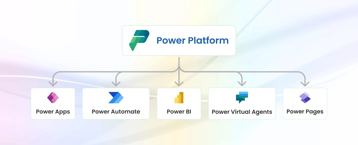
2. Power Apps Embedded in Power BI

  • Embed a Power Apps form inside the Power BI report.
  • Users fill out the form; then Power Apps writes data to Dataverse or SQL.
  • Power BI visuals are refreshed (or re-query) to show updates.

3. Custom API / Service Layer

  • Build a backend service (REST API) that handles writeback requests.

  • This service can apply validation, permission checks, business logic, then write to a governed database.

  • Power BI calls this service from visuals (e.g., via button click), and afterward, reads the updated data.

4. Native Writeback with Microsoft Fabric

  • With Microsoft Fabric, Power BI can leverage User Data Functions (UDFs) to write back to a Fabric SQL database.

  • This is more “native” (no need for external Power Apps or third-party visuals), and leverages modern Fabric architecture.

5. Writeback Comments / Notes

  • Some visuals allow writing comments or annotations directly on a Power BI report.

  • You can capture these comments via Power Automate Flows. For example, a “Writeback Comments” trigger captures changes (delta), and then writes them into a database (e.g., Azure SQL, Snowflake).

Common Use Cases

Here are some real-world scenarios where Power BI Writeback brings value:

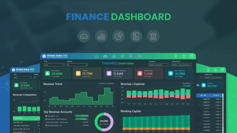
  • Budgeting & Financial Planning:
    Finance teams enter budget numbers, make adjustments, and run “what-if” simulations directly in Power BI.

  • Sales Forecasting:
    Sales reps or managers can update their sales forecasts, and these updates are written back to a central database for aggregated reporting.

  • Data Correction / Master Data Management:
    Users spot data errors (in Power BI) and correct them on the spot, ensuring that data stays clean and consistent.

  • Collaborative Commentary:
    Multiple users write comments or feedback on data points, e.g., on reports or dashboards, which is stored centrally for audit and future reference.

  • Operational Input:
    Teams working in operations (like inventory planning, staffing) input numbers (like headcount, targets) in a Power BI report, to drive planning cycles.

Benefits of Writeback

Let’s list the main advantages in depth:

  • Enhanced Interactivity:
    The Power BI experience is no longer just “view-only”; users can act, input and contribute.

  • Reduced Tool Switching:
    Eliminates back-and-forth between Power BI and Excel or other planning tools.

  • Real-Time Updates:
    When implemented properly, writeback can be near-instant, so data is always current.

  • Better Collaboration:
    Multiple people (from different roles) can contribute within the same BI environment.

  • Governance:
    With audit logs, you get accountability (“who changed what”), which is very important for financial / sensitive data.

  • Scalability:
    With architectures like Fabric + UDFs, writeback can scale to large organizations with many users.

Challenges & Risks

Writeback isn’t trivial. Here are common challenges organizations face:

  1. Data Integrity & Security

    • Allowing users to write data means there must be strict permissions: who can write, what they can write and where.

    • You need validation rules to prevent bad or inconsistent data entry.

  2. Performance Concerns

    • Writing data and then re-querying your data model could impact report performance, especially with large datasets.

    • Frequent writes can increase load on your database or lakehouse, so you need to design your backend to handle that.

  3. User Training

    • Not all users are comfortable entering data in a BI tool; training is needed so they understand the effects of their changes.

    • Mistakes in writeback (like overwriting the wrong row) can cause serious data issues, so guardrails are essential.

  4. Auditing & Compliance

    • You need to maintain comprehensive audit logs. Without these, tracking changes or rolling back incorrect edits is difficult.

    • For regulated industries, writeback may raise compliance concerns (e.g., financial, healthcare).

  5. Complex Architecture

    • Implementing writeback may require extra infrastructure: SQL databases, APIs or services, possibly Power Automate flows.

    • The newer “native” writeback via Fabric UDFs is promising, but organizations need to adopt Fabric and set up their environment accordingly.

  6. Cost

    • Third-party solutions (writeback visuals, Inforiver, etc.) may come with licensing costs.

    • There may be overhead in maintaining APIs, databases, and governance processes.

Best Practices for Implementing Power BI Writeback

Here are some recommended practices based on real-world implementation patterns:

  1. Define Clear User Permissions

    • Set up roles: who can write, what fields they can change, and whether they can insert new records or only update.

    • Use row-level security (RLS) or other security models to granularly control data entry.

  2. Implement Data Validation

    • Use validation logic in your writeback layer (forms, API) so erroneous or invalid input is rejected.

    • Use dropdowns, date pickers, and controlled UI inputs to minimize “free text” mistakes.

  3. Audit Logging & Change Tracking

    • Maintain detailed audit logs: who changed what, when, old vs new value.

    • Regularly review these logs (or alert) for unusual or unauthorized activity.

  4. Use Efficient Data Architecture

    • If using Fabric, leverage User Data Functions (UDFs) for native writeback.

    • Optimize your backend to handle write volume e.g., batch writes, or use a write-optimized store.

  5. Train Users Properly

    • Provide training so users understand not just how to write data but why they’re doing it, and what the downstream impact is.

    • Maintain a sandbox or test environment for users to practice before writing to production data.

  6. Govern with Policies

    • Have a data governance policy specifically for writeback. Who approves it? When can users change data? What workflows exist for correction or rollback?

    • Review and update these policies periodically based on usage patterns and risk.

  7. Monitor Performance

    • Keep an eye on the performance of your writeback architecture. Monitor latency, database load, report refresh times.

    • Use optimizations (indexing, batching, efficient schema) to ensure scalability.

  8. Document Use Cases & Feedback

    • Document which writeback use cases you support (budgeting, forecasting, notes, etc.).

    • Collect feedback from users so you can refine interfaces, validation, and workflows.

Emerging Trends: Native Writeback with Microsoft Fabric

One of the most exciting developments is native writeback in Microsoft Fabric. Instead of relying on external visuals or Power Apps, you can now use User Data Functions (UDFs) in Fabric to write data from Power BI directly into a Fabric SQL database.

  • UDFs act like endpoints: you define a function that receives user input (via Power BI), do validation or business logic, and then commit to a Fabric SQL table.

  • This setup reduces architectural complexity and improves performance, because everything stays within Fabric (Power BI, SQL, compute).

  • It’s a “first-party” way to write back, aligning with Microsoft’s long-term direction for analytics and data management.

Final Thoughts

Power BI writeback is a powerful capability that shifts Power BI from being just a reporting tool to a more interactive data management platform. It enables real-time collaboration, planning, forecasting and data correction all within the same BI ecosystem.


However, implementing writeback requires careful planning: security, governance, architecture, and performance are all critical. When done right, especially with modern platforms like Microsoft Fabric, writeback can deliver major business value by making insights actionable and enabling teams to work more collaboratively and efficiently.

Empower Your Team With Live Data Input. Let’s Talk

Share this blog on:

Search Blog

About Us

Global Data 365 is composed of highly skilled professionals who specialize in streamlining the data and automate the reporting process through the utilization of various business intelligence tools.

Follow us on:

Struggling with complex reports?

Power BI makes it simple!

Industry dashboards

Subscribe to Our Newsletter

Power BI Writeback: What It Is, Why It Matters and How It Works Read More »

power bi for industry

Top 10 Benefits of Power BI for Industry Analytics

Top 10 Benefits of Using Power BI for Industry-Specific Analytics

power bi for industry

In a world where every industry runs on data, one-size-fits-all analytics simply doesn’t work. Each business sector, from finance and sales to hospitality and manufacturing, needs dashboards designed for its unique KPIs and workflows. That’s exactly where Power BI for industry comes in. Global Data 365’s Power BI Industry Dashboards deliver real-time insights, interactive visuals, and industry-tailored intelligence that help organizations turn data into strategic decisions.

1. Unified Industry Dashboards for Full Business Visibility

With dashboards like the Sales Dashboard, Customer Dashboard, Item Dashboard, Finance Dashboard, Hotel Dashboard and Manufacturing Dashboard offered by Global Data 365, you gain one central platform where cross-functional data converges. This holistic view enables you to identify performance interdependencies for instance: how manufacturing output affects item sales, or how hotel occupancy influences finance metrics.


Example: A Sales Dashboard instantly shows which products and regions drive revenue growth, giving managers visibility from order to profit — all in one place.

2. Industry-Specific KPIs Tailored to Each Domain

Each dashboard is built with metrics meaningful to its domain:

  • Finance Dashboard — profit & loss, working capital, budget variance.

  • Sales Dashboard — order trends, top customers, regional performance.

  • Item Dashboard — SKU movement, inventory turnover, margin by item.

  • Customer Dashboard — customer lifetime value, churn, segmentation.

  • Hotel Dashboard — occupancy rate, average daily room rate (ADR), guest spend.

  • Manufacturing Dashboard — production yield, scrap rate, throughput.
    This precision means data insights are relevant and actionable.

3. Real-Time & Interactive Insights

These Power BI dashboards are interactive: you can filter, drill-down, and explore data in real time. For example, the Item Dashboard might let you click into a SKU and immediately see its sales trend, margin history and inventory status. This immediacy allows faster reaction to emerging issues or opportunities.


Example: In the Hotel Dashboard, live booking data automatically updates occupancy and revenue KPIs, letting hotel managers track daily room performance with accuracy.

4. Deep Drill-Down Analytics Across Industries

From a high-level view you can dive into specifics:

  • In the Sales Dashboard, click into a region to see top items using the Item Dashboard.

  • In the Hotel Dashboard, drill into a property or guest segment to see finance impacts in the Finance Dashboard.
    Such linkage across dashboards ensures you’re not just looking at siloed data, but connected insights.

Example: The Real Estate Dashboard lets you drill from total revenue down to individual property performance, uncovering which properties generate the highest rental yields.

5. Forecasting & Trend-Spotting for Strategic Advantage

Industry-specific dashboards help spot patterns: in manufacturing you may detect yield declines; in hotels you may see an occupancy drop tied to guest reviews; in sales you could spot a SKU losing momentum. These insights help you proactively adjust strategy rather than react after the fact.


Example: The Project Management Dashboard uses historical data to predict upcoming project delays or cost overruns, empowering managers to take preventive actions.

6. Seamless Integration with Business Systems

Dashboards like those from Global Data 365 are built to integrate with ERP, CRM, PMS (for hotels), manufacturing systems, inventory systems etc. That means your Sales, Finance, Manufacturing, Hotel dashboards all pull live from core systems, reducing manual data work and boosting accuracy.


Example: The HR Dashboard automatically syncs employee data from your HRMS, giving you up-to-date insights on hiring trends and workforce performance.

7. Cross-Team Collaboration Made Visual

When each function uses a standardized dashboard (Sales, Item, Customer, Finance, Manufacturing, Hotel), different teams speak the same data language. Sales refers to the Sales Dashboard; operations references the Manufacturing Dashboard; finance looks at the Finance Dashboard. Shared understanding fosters collaboration and alignment.


Example: In the Hospital Dashboard, administrators and department heads can view shared KPIs like patient admission rates and bed occupancy, ensuring medical, finance and operations teams work in sync.

8. Strong Visualizations & Storytelling Power

Power BI’s visual capabilities (charts, heatmaps, slicers, drill-through) are leveraged deeply in Global Data 365’s industry dashboards. You’re not just seeing tables of numbers, you’re seeing visuals that tell a story: e.g., in the Hotel Dashboard a waterfall chart shows revenue by guest segment; in the Customer Dashboard a segmentation treemap highlights high-value groups.


Example: The Restaurant Dashboard uses color-coded visuals to show peak dining hours, top-performing menu items, and customer satisfaction scores, making trends instantly clear to management.

9. Scalable & Customizable for Growth

Whether you’re a single-site hotel or a global chain; a manufacturing plant or a multi-plant operation; a regional sales team or a global sales force the dashboards offered are designed to scale. You can customise them: add new KPIs, adjust visuals, filter by geography, adapt to new products. Global Data 365’s samples show this flexibility across domains.


Example: A Property Management Dashboard can scale from tracking 5 buildings to 500, giving real estate companies unified oversight across all assets.

10. Informed Decision-Making Across Industries

The ultimate benefit: with all these dashboards (Sales, Customer, Item, Finance, Hotel, Manufacturing) you can make data-driven decisions with confidence. Want to know how a drop in item inventory is impacting sales? Or how a shift in manufacturing yield is shaping cost of goods sold and finance margins? Or how guest behaviour in a hotel correlates with revenue trends? These dashboards tie it all together.


Example: The Logistics Dashboard helps identify delivery delays, optimize routes, and track shipment costs, enabling logistics managers to make real-time operational decisions that cut expenses and improve reliability.

Final Thoughts

Leveraging industry-specific dashboards from Global Data 365 built in Power BI isn’t just about better reporting, it’s about enabling actionable, domain-specific insights across your business. Whether you operate in sales, manufacturing, hospitality, or finance, you get tailored views, real-time data, visual storytelling and cross-department alignment.

Ready for Smarter Industry Decisions? Let’s Talk

Share this blog on:

Search Blog

About Us

Global Data 365 is composed of highly skilled professionals who specialize in streamlining the data and automate the reporting process through the utilization of various business intelligence tools.

Follow us on:

Struggling with complex reports?

Power BI makes it simple!

Industry dashboards

Subscribe to Our Newsletter

Top 10 Benefits of Using Power BI for Industry-Specific Analytics Read More »

power bi data modeling

Mastering Power BI Data Modeling: A Comprehensive Guide

Mastering Power BI Data Modeling: A Beginner's Guide

power bi data modeling

In today’s data-driven world, transforming raw data into actionable insights is essential and Power BI stands out as one of the most powerful tools to make that happen. At the heart of every successful Power BI report lies a well-structured data model. Data modeling isn’t just about connecting tables; it’s about shaping your data in a way that reveals patterns, highlights trends, and supports confident decision-making. Whether you’re a beginner exploring Power BI or a seasoned user aiming to refine your approach, this comprehensive guide will walk you through everything you need to know to master power bi data modeling from core concepts and best practices to advanced structuring techniques.

What is Data Modeling in Power BI?

Power BI Data modeling is the process of analyzing and defining the various types of data your business collects and generates, as well as the relationships between them. This process involves creating visual representations of data as it is utilized within your business.  


Overall, data modeling is a strategic exercise that aims to understand and clarify your organization’s data requirements. 

Why Data Modeling is important?

Data modeling in power bi helps document the data you have, how it’s used, and your requirements for its usage, protection, and governance. Through data modeling, your organization: 


  • Establishes a framework for collaboration between IT and business teams. 
  • Identifies opportunities to enhance business processes by defining data needs and uses. 
  • Saves time and money by planning IT and process investments effectively. 
  • Reduces errors and improves data integrity by eliminating redundant data entry. 
  • Improves the speed and performance of data retrieval and analytics by planning for capacity and growth. 
  • Sets and tracks key performance indicators tailored to your business objectives. 


Data modeling provides not just the results, but also the process, which offers significant benefits. 

What are the three levels of Data Abstraction?

There are many types of data models with different types of possible layouts. Three main kinds of modeling to represent levels are mentioned below:

Data Abstraction Levels

- Conceptual Data Modeling

A conceptual data model is the “big picture” model that defines the overall structure of your business and its data. It organizes business concepts as defined by your stakeholders and data architects. For example, you may have entities like customers, employees, and products, each with relationships to other entities. These entities and relationships are defined in your conceptual model. 

- Logical Data Modeling

A logical data model expands on the conceptual model by specifying the attributes of data within each entity and the relationships between those attributes. For example, it might specify that “Customer A” purchased “Product B” from “Sales Associate C.” This model represents the technical rules and data structures as defined by data architects and business analysts. It helps inform decisions about the physical model needed to support your data and business requirements. 

- Physical Data Modeling

A physical data model is the implementation of the logical data model. It is created by database administrators and developers for a specific database tool and data storage technology. This model includes data connectors that enable the data to be accessed throughout your business systems as needed. The physical data model represents the actual implementation of your data estate, integrating the decisions made in the conceptual and logical models. 

Data Modeling Process and Techniques

Data modeling is inherently a top-down process, beginning with the conceptual model to establish the overall vision, then progressing to the logical model, and finally to the detailed design contained in the physical model. 


Modern data modeling tools can assist in defining and building logical and physical data models and databases. 

Typical Data Modeling Techniques and Steps:

  1. Identifying Entities and Attributes:
    Determine the main entities (such as customers, products, or orders) and their attributes (such as name, address, or price). 

  2. Defining Relationships:
    Establish how entities are related to each other (e.g., one-to-one, one-to-many, many-to-many). 

  3. Normalizing Data:
    Organize data to minimize redundancy and dependency, typically achieved through normalization to reduce data duplication. 
  1. Creating Data Models:
    Develop conceptual, logical, and physical data models based on the identified entities, attributes, and relationships.   
  1. Implementing Data Models: 
    Translate the physical data model into a database schema that can be implemented in a database management system (DBMS). 
  1. Testing and Refinement:
    Test the data model to ensure it meets the requirements and refine it as needed based on feedback and further analysis. 
  1. Documenting Data Models:
    Document the data model, including its entities, attributes, relationships, and constraints, to facilitate understanding and maintenance. 

By following these techniques and steps, data modelers can effectively design data models that accurately represent the organization’s data and support its business processes. 

Organizing Your Power BI Data Model:

1. Star Schema

The Star Schema is a highly effective way to structure a Power BI data model. In this schema, the Fact table sits at the center of the star, while the Dimension or Lookup tables are positioned at each point of the star. This arrangement allows for easy navigation and analysis of data. 

Star Schema in Data Modeling
Advantages of Star Schema
  • Simplifies queries: Users can easily navigate through the model using the dimension tables to filter and aggregate data in the fact table. 
  • Improves query performance: The denormalized structure of the star schema reduces the number of joins required for queries, leading to faster performance. 
  • Scalability: It is easier to add new dimensions or facts to the model without affecting existing structures. 
Considerations for Star Schema
  • Careful design: Properly design dimension tables to avoid redundancy and ensure data integrity. 
  • Balance between denormalization and normalization: While denormalization improves query performance, it may increase data redundancy. Find a balance based on your specific needs. 

2. Snowflake Schema

The Snowflake Schema is a variation of the star schema where dimension tables are normalized, meaning they are broken down into additional related tables. 

Snowflake Schema by Global Data 365
Advantages of Snowflake Schema
  • Reduces data redundancy.
  • Provides more structure and clarity in data relationships.
Considerations for Snowflake Schema
  • Requires more joins, which can affect performance.
  • Slightly more complex to navigate for report consumers.

Organizing Your Power BI Data Model:

1. Manage Relationships

It’s essential to review and potentially delete any relationships that Power BI automatically generates. It’s often better to manually recreate each relationship to ensure accuracy and alignment with your data model’s design. The Manage Relationships dialogue provides a convenient way to maintain relationships in your data model. 


When using Manage Relationships, you’re presented with the full list of relationships in your model, allowing you to make informed decisions about their configuration and management. 


By carefully managing relationships in your Power BI data model, you can ensure that your reports accurately reflect your data’s structure and relationships, leading to more meaningful insights and analysis. 


When using the Manage Relationships dialogue in Power BI, you can easily view all the From and To tables and columns. This feature makes it simpler to identify any incorrect keys being used to join tables. Additionally, the dialogue presents the state of each relationship, allowing you to activate or inactivate relationships as necessary.

2. Cardinality in a Power BI

The Manage Relationships dialogue also provides a convenient way to view the cardinality and its direction. Ideally, relationships should be either one-to-many or many-to-one. Power BI is proficient at defaulting the cardinality based on your data. To view the cardinality, simply click the Edit button located at the bottom of the dialogue. 

3. Edit Relationships

In the Manage Relationships dialogue, you can also choose the correct cardinality for your relationships. Ensure that your cross-filter direction is either Single or Both, depending on your data model. Power BI defaults to Single for the cross-filter direction. Therefore, if you see that the default is Both, take a moment to confirm that the data in your dataset is loaded and transformed as intended. 

4. Active vs. Inactive Relationships

Power BI allows only one active relationship between two tables, indicated by a solid line. However, you can define multiple inactive relationships (dashed lines), useful for alternative joins (e.g., order date vs. delivery date).

Enhancing Your Data Model with Best Practices

1. Measure Tables:

To add Measure tables in Power BI, you can choose “Enter Data” from the Home menu. Clicking this option opens a window that allows you to create a new table. 

2. Linking Columns:

When linking columns in Power BI, it’s advisable to use the suffix “Key” on any column that will be used for linking. Columns ending with “ID” or “Code” may have different meanings in different tables, so it’s important to be cautious with them. Ensure that columns used for linking have similar names and end with the word “Key.” Additionally, verify that they are of the correct data type. 

3. Column Visibility:

If you are the only one using the Power BI report, column visibility may not be a significant concern. However, if you are publishing a report or dataset for others to use, it’s a good practice to tidy up the column visibility to enhance readability and usability for your audience. 

In Conclusion

In conclusion, data modeling in Power BI is essential for organizing and analyzing data effectively. Key concepts like star schema and normalization, along with best practices for managing relationships and optimizing data models, are crucial for deriving valuable insights from your data. Mastering these techniques can help you unlock the full potential of Power BI, enabling you to make informed decisions and drive business success. 


Ready to elevate your data analysis? Reach out to Global Data 365 today to discover how our Power BI data modeling services can enhance your business insights. Let’s unlock the full potential of your data together! 

Start Automating with Power BI – Reach Out Now!

Share this blog on:

Search Blog

About Us

Global Data 365 is composed of highly skilled professionals who specialize in streamlining the data and automate the reporting process through the utilization of various business intelligence tools.

Follow us on:

Related Resources

Transform Business with Power BI

Get a Personalized Consultation Today!

financial dashboard power bi

Subscribe to Our Newsletter

Mastering Power BI Data Modeling: A Comprehensive Guide Read More »

Power Automate vs Power BI

Power Automate vs Power BI

Power Automate vs. Power BI

Power Automate vs Power BI

In the ever-evolving world of business technology, organizations are constantly seeking tools that can enhance their data-driven decision-making and streamline their operational processes. Two powerful components of Microsoft’s Power Platform, Power BI, Power Apps and Power Automate, have emerged as leading solutions in this landscape. Among these solutions, Power Automate vs Power BI comparisons often arise as businesses explore how these tools complement each other to meet diverse needs.


Power Automate, formerly known as Microsoft Flow, is a powerful workflow automation and process optimization tool. It empowers users to streamline repetitive tasks, automate approvals, and integrate various applications and services seamlessly. With its no-code/low-code development approach, Power Automate makes it easier for both IT professionals and business users to create and customize automated workflows, improving efficiency and productivity. 


While Power BI is a comprehensive data visualization and business intelligence tool that enables organizations to transform their data into meaningful insights. With its intuitive dashboard and report creation capabilities, Power BI allows users to create interactive visualizations, track key performance indicators (KPIs), and uncover valuable trends and patterns in their data. Power BI connects to a wide range of data sources, making it a versatile solution for businesses of all sizes.

21 Key Differences: Power Automate vs. Power BI

Both Power Automate and Power BI are comprehensive tools within Microsoft Power Platform, but they cater to different business needs. Here’s a list of comparison of key differences for Power Automate vs Power BI:

Feature

Power Automate

Power BI

Purpose

Workflow automation and process optimization tool to streamline repetitive task.

Data visualization and Business Intelligence tool to transform data into insights.

Primary Functionality

Specialize in workflow automation, enabling users to automate
tasks, approvals and other business processes.

Focuses on data analysis, visualization and reporting, providing advanced analytics capabilities.

User interface

Visual workflow designer that enables users to create and customize automated workflow
through a drag-and-drop interface.

Intuitive dashboard and report creation interface for both technical and non-technical users to design and customize data visualization.

Development

Follows a no-code/low-code development approach, empowering
both technical and non-technical users to build and customize automated workflows.

Primarily no-code/low-code approach allowing users to create and customize reports and dashboard.

User Cases

Streamlining workflows, optimizing business processes and automating repetitive tasks.

Custom reporting, data-driven decision making, and gaining business intelligence insights, such as finance dashboard, KPI tracking.

Data Integration

It integrates with many Microsoft and third-party applications, allowing users to connect systems
and services to automate workflows and synchronize data.

Connects to a wide range of data sources, including cloud-based services, on-premises databases and Excel, to bring together data for analysis and reporting.

Trigger-based Actions

Supports a variety of triggers, including events, schedules, and triggers from other systems to initiate automated workflows and actions.

Primarily user interactions and data changes, responding to user actions and updates to provide real-time insights.

Collaboration

Allows sharing of workflows and automation processes.

Enables collaboration and sharing of reports and dashboard.

Target Audience

IT professionals, developers, and process owners.

Data analysts, business intelligence professionals, and end-users.

Real-Time processing

Yes.

Yes.

Customization

High level of customization for workflow automation
and process optimization.

High level of customization for data visualization and reporting.

Editing and Improvement

Iterative development through testing and debugging.

Continuous improvement through feedback and updates.

Adaptability

Flexible and adaptable to different workflows and processes.

Flexible and scalable for various data sources and visualization.

Cost and Pricing

Varies based on user count, features used and integration requirement.

Subscription-based included in Office 365 plans and on user count and features used.

Licensing

Licensed per user or workflow runs.

Licensed per user or capacity.

Data transformation

Provide basic data transformation and manipulation features.


Offers advanced data transformation and manipulation capabilities.

Scheduling and Alerts

Offers scheduling and triggering options for workflows.

Provide scheduling options for reports and dashboard.

Mobile accessibility

Provides mobile apps for iOS and android.

Offers mobile apps for iOS, Android and Windows.

AI and Machine Learning

Offers basic AI and Machine learning capabilities through Microsoft AI Builder.

Integrates with Azure Machine Learning for advanced analytics.

Scalability

Scalable for complex workflows and high transaction volumes.

Scalable for complex workflows and high user volumes.

Examples

Approval processes, email notifications, data synchronization.

Sales dashboard, financial reports, KPIs tracking.

Benefits of Power Automate vs Power BI

Power Automate and Power BI are both integral parts of the Microsoft Power Platform, each offering unique benefits to streamline business operations and improve decision-making. 

Here’s a list of benefits for Power Automate vs. Power BI:

Benefits of Power Automate

Power Automate offers the following key benefits:

  • Streamlined workflows and reduced manual effort: By automating repetitive tasks and processes, Power Automate helps organizations increase efficiency and productivity.
  • Improved efficiency and productivity: Automating workflows and integrating various applications and services can significantly enhance an organization’s overall efficiency and productivity.
  • Increased process optimization and automation: No-code/low-code development approach of Power Automate makes it easier for both IT professionals and business users to create and customize automated workflows, leading to improved process optimization.
  • Seamless integration with Microsoft and third-party applications: The ability of Power Automate to connect with a wide range of applications and services, including those within the Microsoft ecosystem, enables organizations to streamline their operations and data flows.

Benefits of Power BI

Power BI offers several key benefits for organizations:

  • Improved data-driven decision making: The advanced analytics and visualization capabilities of Power BI enable users to make more informed decisions based on data-driven insights.
  • Enhanced data visualization and reporting: The tool’s intuitive dashboard and report creation features allow users to create visually appealing and informative data visualizations.
  • Increased business intelligence and insights: The ability of Power BI to connect to a wide range of data sources and provide comprehensive business intelligence helps organizations gain deeper insights into their operations.
  • Seamless integration with the Microsoft ecosystem: As part of the Microsoft Power Platform, Power BI integrates seamlessly with other Microsoft products, such as Office 365 and Azure, providing a cohesive user experience.

Choosing the Right Tool: Power Automate vs. Power BI

Choosing between Power Automate and Power BI depends on your business needs. Power Automate is ideal for streamlining workflows and automating repetitive tasks, while Power BI empowers you to analyze data, create visual reports, and make data-driven decisions. Both tools complement each other, offering a powerful combination of automation and analytics to enhance efficiency and insights.

Power Automate:

  • For workflow automation and process optimization
  • To streamline repetitive tasks and manual processes
  • When integrating multiple applications and services is necessary
  • For automating tasks and notifications

Power BI

  • For data analysis and reporting needs
  • To create interactive dashboards and reports
  • When data visualization and insights are critical
  • For business intelligence and data-driven decision making

In Conclusion

Power Automate and Power BI are powerful tools within the Microsoft Power Platform, each offering unique capabilities to address different business needs. By understanding the key differences, benefits, and use cases of these two tools, organizations can make informed decisions on which one (or a combination) to leverage for their specific requirements. Whether it’s data-driven decision-making or workflow optimization, the Power Platform provides a comprehensive suite of solutions to help businesses thrive in the digital age.


Ready to transform your business processes? Contact us today to discover how Power Automate vs Power BI can revolutionize your operations and drive efficiency. Let our experts guide you in selecting and implementing the right solutions for your organization. Reach out now and start your journey towards enhanced productivity and insightful decision-making!

Start Automating with Power BI – Reach Out Now!

Share this blog on:

Search Blog

About Us

Global Data 365 is composed of highly skilled professionals who specialize in streamlining the data and automate the reporting process through the utilization of various business intelligence tools.

Follow us on:

Transform Business with Power BI

Get a Personalized Consultation Today!

financial dashboard power bi

Subscribe to Our Newsletter

Power Automate vs Power BI Read More »

what is power BI

What is Power BI?

What is Power BI? A Beginner’s Guide

what is power BI

Modern businesses depend on data, and we’re producing more of it than ever before. However, accumulating volumes of digital data is useless unless companies can make use of it. Business intelligence tools can help with this. Are you planning to introduce a platform to assist you in extracting valuable, actionable insight from your data? You have arrived at the right place. In this blog, we will go over the fundamentals of Microsoft Power BI, like what it can do, what it costs, and what benefits it can provide to your company.

What is Power BI?

Power BI is a business analytics tool by Microsoft that empowers organizations to visualize and analyze data, enabling data-driven decision-making. It allows users to connect to various data sources, transform data, and create interactive reports and dashboards. 


Mainly, it draws data together and transforms it, transforming it into meaningful insights, including using visually convincing and easy-to-process charts and graphs. This allows users to create and share simple and useful snapshots of what’s happening in their market. 

What is Power BI Used For?

It is primarily used for: 

  • Data Visualization: Creating visually appealing reports and dashboards that help users understand data trends and patterns. 
  • Business Intelligence: Transforming raw data into actionable insights to support strategic decision-making. 
  • Data Analysis: Allowing businesses to analyze data from multiple sources in real-time. 
  • Reporting: Developing detailed, interactive reports that provide in-depth insights and promote alignment across the organization. 
  • Sharing & Collaboration: Facilitating collaboration among team members by sharing insights and reports in a secure and controlled environment. 
  • Financial Analysis: Create and analyze financial reports to understand business performance. 
  • Marketing and Sales: Leverage data to improve customer engagement and sales strategies. 

Components of Power BI

The tool comprises several key components, each serving a specific purpose: 


  • Power BI Desktop: A desktop application used to create and publish reports. It offers robust data modeling and visualization capabilities and serves as the primary tool for data analysts. 
  • Power Query: Power Query is a powerful tool for data cleaning and transformation, enabling users to manipulate data from various sources effortlessly. Its intuitive interface streamlines complex processes, ensuring data is efficiently prepared for analysis. 
  • Model View: A data modeling component that allows users to create complex models, define relationships, and perform calculations using DAX. 
  • Report View: An interactive data visualization tool that allows users to create dynamic charts, graphs, and maps for data exploration. 
  • Power BI Service: A cloud-based platform that allows users to share, collaborate, and consume Power BI reports and dashboards. It is ideal for distributing insights across an organization. 
  • Power BI Mobile: Mobile applications available for iOS, Android, and Windows devices, enabling users to access their reports and dashboards on the go. 
  • Power BI Report Server: An on-premises server that can host and manage Power BI reports and paginated reports. It is particularly useful for organizations that need to keep their data on-premises due to security or compliance requirements. 

Benefits of Using Power BI

Power BI transforms a company’s data into actionable reports and insights by connecting to various data sources and cleaning the information for better comprehension. This enables the creation of shareable reports and visualizations that enhance collaboration across teams.

  • Comprehensive Data Insights: Users can analyze historical data, monitor current trends, and leverage predictive analytics to anticipate future outcomes.
  • Advanced Analytics: Power BI harnesses machine learning capabilities to identify patterns in data, helping businesses make informed decisions and generate forecasts.
  • Interactive Dashboards: Users can create personalized dashboards tailored to their specific needs, ensuring quick access to vital information.

As a stable Microsoft-hosted cloud service, Power BI provides users with seamless access to dashboards, reports, and applications via web browsers or mobile apps for Windows, iOS, and Android. Other benefits of using it include:


  • Powerful Visualization Tools: Enhance data understanding with robust visualization features that turn complex data into clear, actionable insights.
  • Cloud-Based Advantages: Benefit from cutting-edge intelligence technologies and powerful algorithms that are regularly updated, ensuring users always have access to the latest tools.
  • Customizable Dashboards: Tailor dashboards to highlight the most relevant data, allowing users to focus on key performance indicators (KPIs).
  • Real-Time Alerts: Set up alerts for critical metrics, keeping users informed of any significant changes or updates in their data.
  • User-Friendly Interface: Enjoy a more intuitive experience compared to complex spreadsheets, making data analysis accessible to users at all skill levels.
  • Robust Data Security: Ensure data protection with granular access controls, allowing for secure sharing of information both internally and externally.

Power BI Architecture

The Power BI architecture is designed to provide flexibility and scalability. It consists of the following layers: 


  1. Data Sources: Power BI connects to various data sources, including databases, cloud services, and files. Data is extracted and transformed. 
  2. Data Storage: After extraction and transformation, data is stored in the Power BI cloud-based service or on-premises in the Power BI Report Server.
  3. Data Modeling: Users can create relationships between different data tables, define calculations, and create data models using Power BI Desktop.
  4. Data Visualization: Users create interactive reports and dashboards using the visualization tools provided in Power BI Desktop. 
  5. Report Publishing & Collaboration: The Power BI Service is where reports and dashboards are published and shared. It also handles user management, security, and data refresh.

Power BI Services

It offers several services that enhance its functionality: 


  • Power BI Pro: A subscription-based service that provides enhanced collaboration and sharing features. 
  • Power BI Premium: Offers dedicated cloud resources, greater data capacity, and advanced features, such as paginated reports and AI capabilities. 
  • Power BI Embedded: Aimed at developers, this service allows reports and dashboards to be embedded within custom applications. 


Find the newest article on how to connect Power BI to Claude using MCP Server: Connect Power BI MCP Server to Claude Desktop

Power BI Dashboard

A Power BI Dashboard is a single-page, interactive view of your data, created from one or more reports. It allows users to monitor business metrics briefly and drill down into details as needed. Dashboards can be customized with various visualizations, such as charts, graphs, and tables, and can be shared with others for collaborative decision-making. 

Top Power BI Pack of Dashboards

We offer a customized dashboard package tailored to meet the unique needs of your business. Our dashboards are designed to provide real-time insights and help you make data-driven decisions with ease. Whether you’re looking to optimize financial performance, streamline inventory management, or drive sales, our Power BI dashboards will give you the tools you need to achieve your business goals.

Here’s what you can expect in our Top Pack of BI Dashboards which includes following:

  • Finance Dashboard: Gain in-depth insights into your financial operations, track key financial KPIs, and improve budgeting and forecasting accuracy.
  • Inventory Dashboard: Track inventory levels, reduce waste, optimize stock levels, and improve inventory turnover rates with real-time data insights.
  • Sales Dashboard: Get a comprehensive view of your sales data, identify high-performing products, and make strategic decisions to boost revenue.
  • Purchases Dashboard: Manage purchasing activities, monitor supplier performance, and control procurement costs effectively. 
  • Retail Sales Dashboard: Analyze retail sales performance, track customer trends, and optimize inventory levels for maximum profitability.
  • HR Dashboard: Track employee analysis, record payroll and recruitment for informed organizational decision-making.

Why Choose Our Dashboard Packs?

  • Ready-to-Use: Get started quickly with pre-built dashboards tailored to your industry. 
  • Customizable: Easily adjust visualizations and data models to fit your specific needs. 
  • Comprehensive Insights: Access a wide range of metrics and KPIs for in-depth analysis. 
  • Expert Support: Benefit from our dedicated support team to help you get the most out of your dashboard packs. 

Who Can Use it?

Although business intelligence products are usually the territory of business analysts and data scientists, Power BI’s user-friendly nature enables it to be used by a wide range of people within an organization. Power BI will build customized dashboards based on the data you want to see and the details you need. 


It’s mainly used by business intelligence practitioners to build data models and reports that are then circulated to their company. It is frequently used as a self-service tool by different sections of the business to check on progress and gain insight into their team’s success. Not all companies, however, would have the scale or need to support a full-time data whiz, so it is frequently used as a self-service tool by various branches of the business to check on performance and gain insight into their team’s performance. Power BI will report on almost anything because it operates with whatever data you give it. Finance, Retail Sales, Inventory, Sales, and operations are among the divisions that use it the most. 

Takeaway

Global Data 365 offers financial analytics solutions for the entire Microsoft Dynamics software products. We have been assisting business leaders in getting the knowledge they need effectively, reliably, and efficiently for almost 8+ years. We offer a wide range of Power BI Training Programs, if you want to learn it from beginner to advanced level. Get Consultation and choose the best training for you or your team, to revolutionize your reporting. 


If you want to learn more about how Power BI can transform your business operations, we suggest learning more about the advantages of our quick but efficient reporting tools. 

Register Now and Get 25% off on Power BI Training!

Share this blog on:

Search Blog

About Us

Global Data 365 is composed of highly skilled professionals who specialize in streamlining the data and automate the reporting process through the utilization of various business intelligence tools.

Follow us on:

Interact Live with Dashboards

Boost efficiency with Power BI – now on 20% off!
dashboards

Subscribe to Our Newsletter

What is Power BI? Read More »

power bi vs jet reports

Power BI vs. Jet Reports: 11 Key Differences

Power BI vs. Jet Reports: 11 Key Differences

power bi vs jet reports

Power BI vs. Jet Reports: the ultimate comparison between two powerful tools that cater to different aspects of data analysis and reporting, each with its strengths and unique features. 


Power BI, developed by Microsoft, is a comprehensive business analytics tool that enables users to visualize and analyze data through interactive reports and dashboards. It excels at creating interactive dashboards and reports for tailored insights. However, Power BI does have some limitations when it comes to financial and operational reporting. Creating reports is complex, requiring DAX scripting and technical knowledge. It lacks drill-down capability to Dynamics NAV/365 Business Central, and needs detailed transactions in the data model. 


While Jet Reports is a business reporting solution designed to work with Microsoft Dynamics ERP systems, such as Dynamics NAV and Dynamics 365 Business Central. It provides fast, flexible financial and business reporting within Excel environment. It simplifies access to information by enabling real-time reporting on Microsoft Dynamics data and allows easy sharing of reports across your organization. 

Power BI and Jet Reports: What's the difference?

Both Power BI and Jet Reports are complementary tools in the realm of data analysis and reporting, but they have core differences in their functionality and focus. 

Aspects 

Power BI 

Jet Reports 

Purpose

Microsoft’s robust analytics, best for data visualization and dashboards with interactive visuals.

Focused on detailed financial and operational reporting from Dynamics ERP.

Interface  

Uses Power BI Desktop, requires learning for new users.

Integrates with Excel, familiar for finance professionals.

Visualization

Offers rich, interactive visuals with numerous chart types.

Basic visualizations, prioritizing details on transactions.


Data Integration  

Connects to various on-premises, cloud, and third-party sources.

Optimized for Microsoft Dynamics ERP data.

Customization

Strong visual customization, limited for detailed formatting.

High flexibility in formatting and layout via Excel.


User Base

Used by executives and analysts for high-level insights.

Preferred by finance teams for detailed reporting.


Security 

Robust security with role-based access and Azure integration. 

Utilizes the NAV-BC security model, eliminating the need to manage a separate security model. 

Real Time Reporting

Supports live data and frequent refreshes.

Real-time data from Dynamics ERP. 

Drill-down Capabilities 

Advanced drill-down on interactive dashboards.

Excel-based drill-down functionality.

Report Scheduling and Distribution 

Automates report sharing via Power BI Service.

Reports scheduled and distributed directly from Excel.

Dimensions 

Supports dimensional analysis for detailed data slicing.

Works seamlessly with Dynamics dimensions.


In Conclusion

In conclusion of Power BI vs. Jet Reports; both offer valuable solutions for data analysis and reporting, each has its own strengths and focus. Power BI is a comprehensive tool suitable for users working with diverse data sources, offering advanced data visualization and analysis capabilities. On the other hand, Jet Reports, is specifically designed for reporting of Microsoft Dynamics ERP systems, providing a more streamlined and tailored reporting solution. 


The core differences between Power BI and Jet Reports lie in their functionality and integration capabilities. Power BI requires manual or scheduled refreshes for its data model and lacks real-time reporting directly from the ERP. In contrast, Jet Reports enables real-time reporting by directly refreshing reports against the live ERP system, providing a more seamless and integrated reporting experience within the Dynamics environment. 


Ultimately, the choice between Power BI and Jet Reports depends on the organization’s specific needs and requirements. Power BI is ideal for users who require extensive data visualization and analysis capabilities, while Jet Reports is more suitable for users within the Dynamics ERP environment who need a specialized reporting solution. Integrating these tools can enhance an organization’s data analysis and reporting capabilities, especially for those leveraging Microsoft Dynamics ERP systems. 


Still exploring which solution is right for you? Our experts are here to help! Contact us today to discuss your unique business needs and find the perfect fit. 


Our team will guide you through the features and benefits of both Power BI and Jet Reports, helping you understand how each solution aligns with your goals. Whether you need advanced data visualization and analysis capabilities or a specialized reporting tool for Microsoft Dynamics ERP systems, we’ll help you make an informed decision. 


Don’t let uncertainty hold you back. Contact us today and discover which tool; Power BI vs. Jet Reports leads you to winning data transformation!

Unlock Powerful Insights: Get Your Free Jet and Power BI Demo!

Share this blog on:

Search Blog

About Us

Global Data 365 is composed of highly skilled professionals who specialize in streamlining the data and automate the reporting process through the utilization of various business intelligence tools.

Follow us on:

Related Resources

Transform Business with BI Tools

Get Free Personalized Consultation Today!

Project Management Dashboard Power BI

Interact Live with Dashboards

Increase efficiency and deliver success now with Microsoft Power BI. Enjoy a 20% discount on all Power BI services.

dashboards

Subscribe to Our Newsletter

Power BI vs. Jet Reports: 11 Key Differences Read More »

Power BI with Jet Analytics

Power BI with Jet Analytics

Power BI with Jet Analytics

Power BI with Jet Analytics

Business intelligence is a much better and less expensive choice than data warehousing for 90% of small to mid-size businesses. Both systems used together; Power BI with Jet Analytics have the same overall goal: to improve data analysis. The immense effort and cost needed to define the data tables and relationships required to drive analytics put data warehousing out of reach for most businesses. Due to the extreme minimal effort and expense needed to get it up and running, business intelligence is becoming the choice of small to mid-size companies, irrespective of which of the two most popular options are used.


Jet Analytics from insightsoftware (previously Jet Global) and Power BI from Microsoft are the two most popular business intelligence options in the Microsoft Dynamics environment. Jet Analytics can use either Excel or Jet Reports as a reporting tool, allowing you to have the best experience. Jet Analytics uses pre-defined data cubes to describe the patterns in the data necessary for reporting. Because the table relationships required for accounting, which are focused on financial processes, are not always the same as those required for business analysis, which could be more operational, this method works. This method has many disadvantages, including a higher initial cost, more work to create new data relationships into the data cubes, and the fact that data is only as current as of the last update.


A major benefit is the simplicity with which new reports can be created if they match the data cubes, as well as the improved accuracy since the reports are run against a replica of the output database rather than the live database itself. Data can be processed into data cubes from various sources, not all accounting systems.

Benefits of Using Power BI with Jet

Power BI depends on one or more databases to provide real-time or near-real-time data. This means that data is updated in real-time, but output for more detailed reports will not be optimal. Almost any form of the report can be created and distributed through the web or mobile devices. Every consumer can create their own dashboards, each with its own unique insight. It is possible to set up alerts. The details behind the reports can be drilled down by users. To use Power BI, you will need an Office 365 subscription.


You cannot really go wrong anyway. Invest a little more upfront to identify data relationships using data cubes in Jet Analytics or subscribe to Office 365 and use Microsoft BI Power to provide your users real-time access to important analytical data. To explore more about these better, less expensive alternatives for your company, we offer 30 days free trial license for you to test it on your very own database or get a personalized training for yourself.

Get a Free Demo of Power BI with Jet Analytics!

Share this blog on:

Search Blog

About Us

Global Data 365 is composed of highly skilled professionals who specialize in streamlining the data and automate the reporting process through the utilization of various business intelligence tools.

Follow us on:

Want to try Jet Analytics?

Integrate Power BI with Jet Today!
Jet Analytics Hero Section

Subscribe to Our Newsletter

Power BI with Jet Analytics Read More »

Limitations of Power BI

Limitations of Power BI – Are They Risky?

Limitations of Microsoft Power BI

Limitations of Power BI

If your business is considering implementing Microsoft’s Power BI analytics framework, you must understand the level of complexity and limitations of Power BI involved in successful integration. Power BI is a many-month software project based on a complex mix of technological elements, not just a device you install and customize. To get it right, you’ll need a lot of preparation and the highest level of management skills. So, what is Power BI and what are some limitations of Power BI?

Power BI

Microsoft’s Power BI is a cloud-based business intelligence service package. It uses insightful visualizations and tables to transform raw data into usable information. Data can be processed and used to make strategic business decisions in a short amount of time. Power BI is a set of business intelligence and data visualization tools that includes software services, applications, and data connectors. Power BI is a user-friendly tool with versatile drag-and-drop design and self-service capabilities. Power BI can be used on both on-premises and cloud systems.

So, what are the limitations of Power BI that you can avoid?

What is Jet Reports?

Jet Reports, on the other hand, is a dynamic business intelligence tool that goes beyond conventional financial reporting. With its user-friendly interface and Jet Dashboard Designer, organizations can leverage its capabilities for comprehensive financial reporting and analysis. Jet Reports is known for its adaptability and ease of use, making it an asset for businesses aiming to enhance their reporting processes. 

We are going to give you three scenarios where a user should consider switching to Jet Reports or Jet Analytics: 

Complexity Involved with Power BI

Most of us have become used to applications that can be downloaded in minutes or even hours in the case of more advanced systems. That’s a fairly straightforward scenario. At the other side of the curve are items that entail some configuration and are designed and implemented by a team of specialized experts to overcome the limitations of Power BI. A full Power BI implementation must solve a slew of design issues. The answers to those questions will affect efficiency, productivity, and adaptability in the long run. Some of the major differences between a Power BI cloud deployment and an on-premise deployment. For instance:


– What features should you run, where should they run, and how will they all interact?


– What level (or levels) of security do you incorporate?


– Will you be using SQL Server Analysis Services to model your results, or will you use the Power BI desktop tool?


– Should you use Power BI’s Direct Query function or import data?


– Will a gateway component be needed, and if so, where will it be installed?


All these are technical questions, but the solutions have long-term consequences, and it’s always difficult to adjust later. This level of complexity necessitates upkeep, which entails additional costs and disruption.

Power BI: Toolset not a Complete Solution

There are no reports included with Power BI out of the box. In fact, Power BI reporting necessitates a substantial upfront expenditure, not just in terms of constructing the technological infrastructure, but also in terms of deciding how you access the data, how and when data must be converted or pre-processed, where you archive them, and so on. After you have answered those design considerations and limitations of Power BI, you will need to put in a lot of time to set up the data access and data flow.


Data access is becoming more complex in this age of cloud computing. This is particularly true of Microsoft Dynamics 365 products, which no longer require unlimited reporting access. Microsoft has suggested some possible workarounds, but all of them require major compromises. Microsoft has introduced an indirect layer of “data entities” in Microsoft Dynamics 365 Finance & Supply Chain Management (D365 F&SCM), for instance, that developers can use to obtain entry to ERP data. Personalizing Power BI can be very costly. Since every company is different and has its own set of requirements, customization is unavoidable. Recurring costs arise from the ongoing maintenance of such customizations.

Power BI as a Dashboard Visualization Tool

Power BI was developed to be used as a dashboard visualization tool. It does an adequate job of producing conventional tabular reports, lists of individual records with several columns and subtotals, and it does a great job of providing an insightful visual analysis of what is happening in the market. Traditional banking statements are not generated by Power BI because they are somewhat different from other forms of reports. Some more limitations of Power BI such as Filtering, masking, or grouping GL sums by account column, for example, is commonly required when creating a P&L statement. This is often done in different ways for each row in the report.


Columns in the report may be sorted by organizational agency or division, or they can be used to reflect various time spans, budget vs. real, or variance amounts or percentages. Since Limitations of Power BI has a little method of controlling such distinctions, having it generate a comparatively straightforward P&L is a very costly custom programming activity.

Power BI without the Limitations

Global Data 365 offers self-service, user-friendly analytics and reporting tools, as well as collaboration with Power BI and Excel. With the help of Jet Analytics, we hold the guesswork out of Power BI by automating the process of developing a data warehouse with pre-built connectors for over 140 different ERP systems, allowing business leaders and analysts to have the data they demand, when they need it, without any need for specific commands or the complexity and limitations of Power BI stack.


Need to overcome the limitations of Power BI, opt for our Power BI Training program today.

Register Now and Get 25% on Power BI Training!

Share this blog on:

Search Blog

About Us

Global Data 365 is composed of highly skilled professionals who specialize in streamlining the data and automate the reporting process through the utilization of various business intelligence tools.

Follow us on:

Want to try Power BI?

Get a Free Consultation Today!
power bi dashboard

Subscribe to Our Newsletter

Limitations of Power BI – Are They Risky? Read More »

Why-Power-BI-Is-a-Better-Choice-than-Excel-for-Analytics

Why Power BI is a Better Choice than Excel for Analytics

Why Power BI is a Better Choice than Excel for Analytics?

Why-Power-BI-Is-a-Better-Choice-than-Excel-for-Analytics

Modern businesses depend on data, and we’re producing more of it than ever before. However, accumulating vast volumes of digital data is useless unless companies can leverage it effectively. Business intelligence tools, such as Power BI and Excel, can play a crucial role in this process.


Are you planning to introduce a platform to assist you in extracting valuable, actionable insights from your data? You have arrived at the right place. By harnessing the capabilities of Power BI and Excel, you can transform raw data into meaningful visualizations and reports, empowering your organization to make informed decisions based on real-time analytics.


Explore how Power BI and Excel can work together to unlock the full potential of your data, streamline your reporting processes, and enhance your business strategies. Let’s embark on this journey to data-driven success! We will go over the fundamentals of Microsoft’s flagship BI app, Power BI, in this article, like what it can do, what it costs, and what changes it can provide to your company.

Characteristics of Power BI Desktop

– Can link to several different data sources. With the Auto-Refresh option, you can keep this data up to date.

– It aids in the rapid modelling of data.

– Using the drag and drop map, it is possible to generate interactive reports.

Characteristics of Power BI Service

– It is a web portal that allows users to monitor and view reports generated with Power BI Desktop.

– Reduce the amount of time spent moving and sharing information.

– Data can be imported from a variety of on-premise sources (Excel, DB, CSV, etc.) or directly documented from a variety of cloud web services, including Azure, MailChimp, Zendesk, and Salesforce.

Why should you Choose Power BI over Excel?

Power BI has many benefits to offer compared to Excel. Listed below are some of the benefits.

- Convenience and Data Size

Power BI can handle massive amounts of raw data as well as several data tables. The analytical tool is capable of loading and processing large amounts of data into a single PBIX file. Multiple tables can be configured and, if necessary, combined based on common fields. In terms of user interface and ease of use, the Power Query Editor and Data Modeling parts are easier to use.

- Data Connectivity and Auto Refresh

One of the key reasons to use Power BI is that it can link to a broad range of data sources, including databases, online sites like Facebook, and Salesforce reports, among others. When compared to the previous data, the data is automatically inserted into the Power BI Workbook. Excel’s ODBC Driver takes up a lot of time.


Power BI has a great choice for keeping data in alignment with the source called Auto Refresh. To have all the reports updated, Power BI Desktop has a Refresh option, and Power BI Service has a Refresh Now, as well as a Scheduled Refresh option. When you choose Refresh, the data in the file’s model is replaced with the most recent information from the original data source. This form of a refresh, which takes place entirely inside the Power BI Desktop program, varies from Power BI’s Refresh Now and Scheduled Refresh solutions.


Power BI uses the information in the database to link to the data sources identified for it, search for updated data, and then upload the updated data into the dataset when you refresh data in a dataset, whether using Refresh Now or setting up a refresh schedule. In Power BI, unlike Excel, the dashboard can be refreshed.

- Reporting and Cross-Filtering

Power BI reporting is much more advanced and engaging than Excel reports, and a single graph can provide numerous perspectives. In Excel, cross-filtering is not possible, but it is possible in Power BI. This has an impact on how users want the filtering for data with table relationships to move.

- Alerts and Emails

To submit a mail and a reminder in Excel, a user has to use the VBA Editor to generate a macro. In Power BI, creating a warning and sending an email when a condition (such as a threshold value) is met has never been easier. This will keep users updated when on the move, and they will be able to view the report at any time and from any place.


Some other features include:


  • Natural Language Query (NLQ): By asking a common person question in Power BI Service, everyone can get a fast response from the current insights. It’s helpful when someone isn’t familiar with the data model but needs fast answers to questions about the insights. Furthermore, this saves a lot of time.
  • Deeper Insights: The backend program, which is driven by intelligence and algorithms, can generate interactive insights at the touch of a button. It will help you save time and interpret data more quickly.
  • Dashboards and Customized Reports: The reports produced can be modified to achieve the desired outcomes. On the dashboard, the report tiles can be rearranged and relocated as desired.

  • Sharing Reports and Access: The reports and dashboards may be shared with the public or only a small group of associates.
  • Downloading and Exporting Dashboards: The Power BI Service lets you download and transfer dashboards in various formats. The dashboards can be submitted as a .PBIX file or exported as a PowerPoint presentation, PDF, or event print.

In Conclusion

In today’s data-driven environment, a fast and efficient data analytics tool is needed. Power BI makes use of business intelligence to ensure that all reports are produced efficiently and provide a wealth of information. Changes in time and technology necessitate the use of a versatile tool like Power BI, which makes work easier and saves time while delivering the best performance. Get a suitable power bi training for your needs or for more information, contact us today!

Register Now and Get 25% Off on Power BI Training.

Share this blog on:

Search Blog

About Us

Global Data 365 is composed of highly skilled professionals who specialize in streamlining the data and automate the reporting process through the utilization of various business intelligence tools.

Follow us on:

Transform Business with Power BI

Get Free Consultation Today!

power bi inventory dashboard

Subscribe to Our Newsletter

Why Power BI is a Better Choice than Excel for Analytics Read More »

BI Dashboard

Everything You Need to Know About BI Dashboard

A Complete Guide about BI Dashboard

BI Dashboard

Business leaders know that having a few clearly identified, measurable objectives and constantly monitoring success against those objectives allows a company to remain on track to meet its primary objectives. Business Intelligence is a system of processes, infrastructure, and technologies that transform raw data into actionable information. It’s a collection of tools and services for turning data into useful information and knowledge. Likewise, over the last few years, business intelligence (BI) dashboards have become very common as a way of communicating key organizational goals and monitoring success against them.


BI dashboard display data in a vivid visual format that can be easily grasped by almost everyone in the company. BI dashboards are an important way for strategically based companies to communicate results against key performance indicators (KPIs) and keep everybody on the same page. Dashboards, in particular, offer a highly efficient way for leaders to interact with non-financial audiences.

What does a BI Dashboard?

Tracking sales revenue and pipeline prospects against the forecast is one of the most popular use cases for BI dashboards. This is often shown alongside other important customer metrics, including returns, on-time delivery, and so on. It’s an explanation that almost anyone in the company can understand, and it’s especially important to C-suite executives and those in every company.


That being said, for finance and accounting practitioners, some use cases for making people aware of other key financial indicators across the entire enterprise are important to consider. For non-technical users, dashboard visualization can be highly effective.


Working capital is one of the most important determinants of business performance. Organizations that successfully control working capital significantly outperformed those that do not. Internalizing main working capital metrics by the rest of the company, on the other hand, can be difficult. High-level indicators of how well the company is doing include the “cash conversion cycle” (CCC) and “days working capital” (DWC).


Not everyone is equipped to understand the numeric data. This is where BI dashboard can be extremely useful. Business leaders can achieve higher performance by clearly defining the most important numbers, communicating them within the company, and publishing performance metrics in a way that everyone can understand regularly.


Explore our collection of different dashboards here: Power BI Department and Industry Dashboards.

BI Dashboard is the Future

As software technology has advanced, BI dashboard have become more common as tools for outlining and presenting business data have become faster and more efficient. A comprehensive toolset is needed to work with massive data sets, work more effectively, and produce dashboards efficiently and precisely. Some of the features of using BI dashboards are:

Data Visualization

Dashboards that are well-designed present data in a way that is useful to the target audience. They give just the effective data, not too much or too little. Furthermore, good dashboards are adaptable to each user’s specific requirements.

Real-Time Alerts

An effective BI dashboard can alert users to circumstances that need urgent attention, similar to warning lights on a car dashboard. A successful dashboard will help business leaders solve issues as soon as they arise by monitoring data in real-time and alerting them to exceptions.

Collaboration

The first step is to get the correct information from people in the company. With easily accessible, sharable content, collaboration features allow discussion and task management. Relevant discussions will send constructive alerts to the appropriate people in the organization, making it easier to collaborate effectively.

Future Predictions about BI dashboard

While the word “dashboard” suggests an emphasis on the past and present, the most powerful dashboard solutions often include rolling forecasts and predictive analytics, allowing for a clearer view of the path ahead.


Global Data 365 includes dashboards and communication tools, as well as effective business intelligence tools. With integration from over 140 different ERP systems and other enterprise software, we allow quicker, simpler, and more affordable business insights. You can request a free demo today to learn more about how your company will profit from the power of BI dashboards.

Talk to Our BI Experts and Set Your Strategy NOW!

Share this blog on:

Search Blog

About Us

Global Data 365 is composed of highly skilled professionals who specialize in streamlining the data and automate the reporting process through the utilization of various business intelligence tools.

Follow us on:

Interact Live with BI Dashboards

Increase efficiency and deliver success now with Microsoft Power BI. Enjoy a 20% discount on all Power BI services.

dashboards

Subscribe to Our Newsletter

Everything You Need to Know About BI Dashboard Read More »

global-data-365-logo
Talk to Our BI Experts!